Sunday, October 28, 2012

proj.3 update/thoughts

After looking through labels off water and other drinks I have concluded that it is hard to stand out and if you want to stand out you have to do little touches like font choice, color and placement of info. Now for the the water logo font i will probably go with a sans serif font that has a nice flow like water to it and counter it with a serif font for the other stuff and i still haven't decided if i want to go with a more traditional blue green color scheme or add a color like orange to the it to spice things up a bit, it's definitely going to be a challenge to try and get things to stand out with out it looking like a soft drink or something besides water but don't worry I GOT IT or maybe not, we will see.


drink labels pt.3

This tea label has some good points and some bad. The good is that the font is alright and the spacing is nice and the different fonts play off each other and it looks like its not totally center which is nice. Some of the bad is that the peach color words don't work at all and they disappear into the background and kind of hurts my eyes. Also the green stroke text on the bottom is horrifying. The same stuff applies to the back as some text look like it's missing. A label that has some bright spots but still needs some loving to make it a solid label.

drinkapoolza

It's always interesting to see all the different drinks lined up in a aisle and see how they look and which ones stand out and why they do or don't stand out. It seems like the ones that are the most successful are the ones that have contrast like yellow liquid and purple label, so it's important to know what colors go together and contrast. Also it seems like all of the labels logos are going at a angle and not somewhere in the middle which is interesting. So to stand out from this pack it is important to have color contrast and the logo or font choice is important since you don't want it blend with the others or get lost.

drink labels pt.2

These labels are for black tiger, i don't know if it is real or not but it does look like something you would see in a store. This label is rather simple with the black background and yellow text and graphic. The font is fine it doesn't stick out or strike as something different but it's not bad neither and i do like he graphic above the text. I would try and flip flop the colors with a yellow background and black text and graphic to see how that would look. Overall a nice label that does some things right and other things need more tweaking or thought.

drink labels pt.1

This label is for a Swedish soft drink and it is a dozy. Usually for soft drinks the logo is the biggest graphical element and there might be some shapes or simple images but usually soft drink are very text heavy but this one has alot going on in the label. With rainbows and helicopters and flying guys its a lot more then were used to and you could lose the name/logo of the product with some much else going on.

Thursday, October 25, 2012

proj. 3 intro/thoughts

For proj. 3 we have to do a water bottle label which requires a lot of info in a small space and using little to know graphics. Obliviously an important aspect is font choice and size because it has to be easy to read while not being too big or small and have to use all the space to your advantage, also despite being able to use any color, there really isn't many colors that you can pull off and make people want to but the water, same goes for the font choices, decisions, decisions.


water bottle label pt.1

The dasani water bottle in my opinion is a clean solid label. It isn't busy, the background is nice and the logo is nice with good spacing, I think that this is the best spaced out of the major brands and the light blue in the middle helps draw your eye towards the name and in my opinion looks better then the black box they used to have over the name, even though it may help it stick out, it was unnecessary considering what the brand is.


Proj.2 final thoughts

I feel pretty satisfied with how proj.2, of course those damn eyebrows are giving me trouble, can't seem to get the shading right, its not bad or anything just needs more tweaking probably going to have yo play around with shading levels more. Felt i accomplished my vision for it and once you realize that it's supposed to look human but not it doesn't become bothersome over some of the features. Overall feel pretty pleased about it.

Tuesday, October 16, 2012

proj.2 update/thoughts

Just finished up the book cover and it came out pretty nice though the lips gave me trouble in getting them curve which is hard to do with just text but they look pretty good, the lack of nose on the face probably adds to the off look since were not used to seeing faces without a nose but I think it would be too much and gives that AI generated interface look i wanted and the fonts I choose I'm happy with and its readable and it looks good, especially since I turned the Title on its side to fix the space issue. Overall I'm pretty happy with and even though the lips could be a little issue or maybe should have tried doing a nose, everybody is just going to have to deal with it.

book covers pt.12

Here is a pretty cool cover for the "paris review interview book". I like the quotation marks because it ties in with quoting someone in an interview and the red makes them pop nicely. Though some of the text is readable and some aren't like 3 of the quotation marks text isn't the easiest to read and the middle is a little odd so i would play around with the sizing of everything but its a solid cover with potential to be better.

book covers pt.11

Here is a all type cover for a book and its pretty neat. Its for designing type and its pretty solid cover. the background is nice and placing the names on the top fits nicely. The designing type part of the title is nice but the with feels off to me and either they need to turn it around or move it somewhere else and the text beneath designing with type gets a little lost.overall a nice cover but expect more from a book about designing type.

book covers pt.10

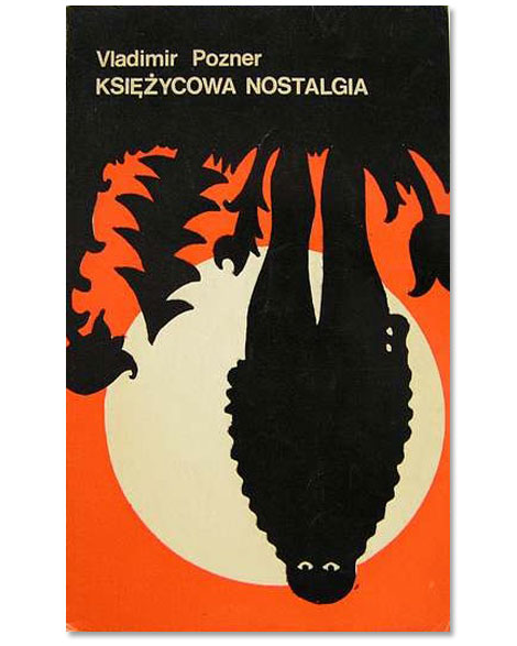
Here is an interesting cover, the background doesn't really bother me, its the title that irks me. First I'm not really a fan of the font, i would try to tie it in more with the background font. Also it is too central
and off putting to the top a bit would make it look nicer, the lined going across the word cut also don't really work, you could make the title like a cut type of font or just rework the lines because it looks like someone was writing something and messed up and crossed it off. There's some potential put needs to go back to the drawing board.

book covers pt.9

This is a neat book cover for the book "Cather in the Rye", I like the look of it with simple drawings and the red and white is neat, how the red only applies to the horse and top and the white on the bottom is nice and gives it a good look. the fonts are fine with a nice use of italics and the yellow stands out nicely though I would like to see the title in white to kind of tie everything in. the font is readable and overall a nice cover.

Sunday, October 14, 2012

proj. 2 update/thoughts

The project is coming together with most of the shading done, going to play around with the shading of the lips and see if i need to add a nose to complete the face. The font spacing and placement is still a work in progress as trying to figure out placement of the title, also need to find a nice clean font for the back and get logos of book company's for side of book. It's coming together just have to refine type and placement and make sure type is right especially for the back because you have to be able to read it and look clean and professional. When it is finished and looks good, i will be happier then the cookie monster seeing a large cookie platter.

book covers pt.8

here is an "interesting" type only cover. i am not a fan of this cover because it is really boring and something they thought of after the deadline passed. The contrast is fine and the spacing but i just don't get any sort of feeling to read this book, maybe some red would help or flip the white and black so that all the weight ins't on top but i think it is a bit weak.

book covers pt.7

This is your typical book cover, with the title, author and image. They do a good job of not centering anything and the light blue back round is nice and the white box is in a nice place where it isn't bothersome or seems out of place. The type is fine though some hierarchy like bold or different font would be nice. The image is cool and obliviously fits the subject. Overall a solid cover.

Sunday, October 7, 2012

proj.2 update/thoughts/intro

For proj.2 we are doing a full book cover(front and back) for the cyberpunk novel nercomancer. Its an intriguing tale and most of the covers haven't gave in some peoples eyes the justice the book deserves. My idea is that one half of the cover or a little over a half will be a VI construct/interface and the other side will have the title and what not and the other half of the VI construct/interface will be on the back. I don't know exactly how to make the VI look right but I will figure it out SOON.

book covers pt.6

Another type centric cover and an intriguing one. The placement is fine but some people might think the authors name is part of the main title since they are the same size and style. For me personally it seems the text is to jumbled but i do like how they fit together in terms of the beginning and end of the words fit together. Overall a cover that does somethings and right and wrong and has alot of potential.

book covers pt.5

This is more a type focused cover for the book lemons are not red(there not?!). It is very centric, which is something you usually want to avoid and typography is so-so, they could have chosen a better font or at least another one to break it up. Maybe could have played around with the sizing a bit more in the title to make it not seem so central. They also could have the word red be red or play around with the background.

book covers pt.4

This is a cover for a polish book were apparently they like things upside down. It doesn't bother that much but i do think the image is pretty neat and would be nice to see it right side up. Not much typography just at the top and since it is in polish i don't know what it says. Also with the image being upside down all the weight is on top and gives it the effect of floating away.

book covers pt.3

This is an interesting cover for the book Chicago. Now i don't know if its about the city or what or it has to do with Egypt or what, im guessing the back would clear that up.The yellow i am not of fan of and i can't get past the images and wondering what they mean or the purpose of them. The typography is alight, though I might use a different font for Chicago, it just doesn't click with me.

book covers pt.2

This book has a relatively simple cover with the plain white background and the glasses. The images i understand but i think it could be represented better but im sure the readers of the book or the target market are find with it. The typography is fine and its not dead center which is nice and overall a solid cover.

book covers pt.1

This book cover for the art of immersion is a intriguing cover with a immersion effect of the human head on the cover that obliviously draws you in and im sure in person it is more effective. Though i would move the author from the top to underneath the title because the authors name gets lost. Also the bottom gets lost. So a nice pic but the typography needs some work.